Try my mobile prototype here!
Hit the “R” button while using prototype to restart
Project Overview
Objective: Develop a mobile app including naming, branding, and UI/UX design.
Purpose: Provide a solution to a user’s needs while generating profit or customer value to your targeted audience.
Scope: This mobile app project was divided into 8 stages over an 8 week period:
Ideation & Research
User Personas
Name, Logo Design, & Style Guide
User Flowchart
Low Fidelity
Design System/UI Design Kit & Mid Fidelity
Hi Fidelity Mockup
Prototype
The Design Process:
Timeline: 8 Weeks
Checkpoints: 8 Stages
Stage 1: Ideation & Market Research
My app solution was to create a web app that consolidates all the essential information a house sitter would need to care for your home, plants, and pets while you're away.
The app’s features:
Plant Care: Photos and simple watering instructions.
Pet Care: Feeding schedules, exercise routines, medication, and vet contacts.
Outdoor/Pool Care: Relevant instructions for applicable properties.
Security: Alarm codes, video camera access, and other security details.
Long-Term Stay: Information on sleeping arrangements and house expectations for sitters staying on-site.
Sharing Capabilities: Ability to share the information via an email sign-in link, so sitters don't necessarily need the app.
The app is designed to be simple, clear, and professional, giving homeowners peace of mind that their home will be well cared for during their absence. It also offers sitters a streamlined experience with easy-to-access, color-coded tasks, either through the app or a downloadable PDF.
Market and Competitors:
Target Audience: The primary target audience for
Den Genie is homeowners seeking a reliable solution for managing and sharing their home care needs.
Users: The app is designed for both homeowners and house sitters, providing a seamless experience for those who need to manage their homes and those entrusted with their care.
Competitors: Key competitors include Trusted House Sitters, Rover, Wag!, Planta, and Leaf’em—each specializing in niche areas like house sitting, pet sitting, or plant care.
Differentiator: What sets Den Genie apart is its all-in-one approach. Unlike competitors that focus on individual aspects of home care, Den Genie consolidates everything into a single platform, enabling users to store and easily share comprehensive house care instructions. This holistic solution makes it more convenient and efficient for users to manage their homes and ensure that sitters have all the information they need.
Stage 2: User Personas
Stage 3: App Name, Logo, & Style Guide
Brand Typography Process:
Logo Typeface: I chose Hegante Black for its smooth, flowing lines that remind me of a genie, while its structured yet soft letterforms balance elegance and strength, representing Den Genie perfectly.
Headers: I selected Poetsen One as a header typeface because it complements Hegante Black, creating a visual connection between the logo and the app interface.
Body Text: For clear and readable text, especially at smaller sizes, I used Source Sans 3. Its clean design makes it ideal for conveying information effectively.
Brand Naming Process:
I believe that "Den Genie" is a clever and memorable name for my mobile app, and it works well for several reasons:
Personalization: "Den" evokes a sense of a personal space or safe haven, suggesting that the app is tailored to the user's preferences, like a cozy retreat where they have control.
Magic and Assistance: "Genie" implies that the app has the power to grant wishes or fulfill desires, which can make users feel that it offers powerful, almost magical, assistance or solutions.
Appeal: The name is catchy and easy to remember, which is crucial in a crowded app marketplace. It stands out and piques curiosity, inviting users to explore what the app can do for them.
Versatility: The name is versatile, allowing for creative branding and marketing strategies. You can play with themes of magic, discovery, and personal empowerment in your design and messaging.
Brand Color Process:
Light Blue
Calm and Trustworthy: Light blue evokes a sense of calm, tranquility, and trust. It helps users feel at ease, reinforcing the idea that Den Genie is a safe and reliable space.
Dark Blue
Professionalism and Stability: Dark blue conveys professionalism, reliability, and stability. This is why I chose it for the “Security” feature, highlighting the app’s dependability.
Orange
Liveliness and Warmth: The "Home" feature is colored orange to create a warm and inviting connection between users and their space, making the home screen feel lively and welcoming.
Yellow
Optimism and Positivity: Yellow is bright and cheerful, promoting happiness and optimism.
Excitement and Engagement: I chose yellow for the "Pets" feature to create a vibrant and engaging interface, enhancing the user experience and making this feature more appealing.
Green
Growth and Harmony: The color green symbolizes growth, balance, and harmony. The shade of green I selected complements the other brand colors well, and making it a perfect choice for the “Plants” category.
These colors come together to form a balanced, vibrant, and appealing brand identity for Den Genie. The combination of calming blues, energetic orange and yellow, and growth-oriented green creates a cohesive palette that is both engaging and reassuring, reflecting the values and user experience I aim to promote.
Stage 4: User Flowchart
The user flowchart clearly maps out the path users will take, from the initial login and sign up to navigating through the various features the mobile app offers. Given that Den Genie primarily serves as a data bank for input provided by homeowners, each category section within the app is streamlined to require just two screen layouts.
This simplicity ensures a smooth, intuitive experience for both homeowners and house sitters, allowing them to access and manage information more efficiently.
Stage 5: Low Fidelity
In the low-fidelity stage, I start by thoroughly researching the platform for which my design is intended. This ensures that my approach aligns with the platform's layout standards and user expectations.
Next, I identify the key pieces of information each page needs to convey and determine their optimal placement. I keep these early sketches simple and straightforward, focusing on the overall layout and how best to utilize the available space. This approach allows me to quickly assess the effectiveness of different layouts and ensures that the design will effectively communicate the necessary information in a clear and organized manner.
Stage 6: Design System/UI Design Kit & Mid Fidelity
As I progressed through the design process, I began creating all the components that I would need on a separate page in Figma. This stage was ideal for developing my app icons, buttons, and input fields, along with defining preferred padding settings for the design system. Include your devices UI/ UX features here too.
Splash Screen & Login/ Sign Up
Labeling your layers and components variants clearly was essential to keeping my components accessible and organized for the later stages of the design process. This meticulous approach helped establish a cohesive and efficient design system.
Additionally, this stage was perfect for setting up the text styles to be implemented across the entire app for consistency. Defining these styles early on provided valuable insights into the hierarchy and readability, allowing for any necessary adjustments to ensure a clear and user-friendly interface.
The first process in developing Den Genie involved moving from initial sketches to mid-fidelity designs.
Here I focused on creating a visually appealing splash screen, followed by designing input fields and buttons for account creation.
To ensure a smooth onboarding experience, I included only the most essential information, minimizing any barriers that could discourage users from proceeding.
Account Setup & Photo Upload
As I continued working on the account setup pages, I realized that the amount of information required before users could access the home page was too much.
To streamline the process, I decided to move details about neighbors, house insurance, and vehicle information to a separate subcategory. This adjustment simplifies the initial setup, making it more user-friendly.
Home Page- 2 Variants & Category Page- Pets
Next, I checked my margins and guides so that I knew how much safe space I had to work with on my artboards.
This allowed me to measure how big each of my category tiles could be on the homepage, to fit 6 without the need to scroll in app.
I also chose to create a second view option for the homepage for users who wanted to see a preview of the tasks that they may still have to do within a certain feature.
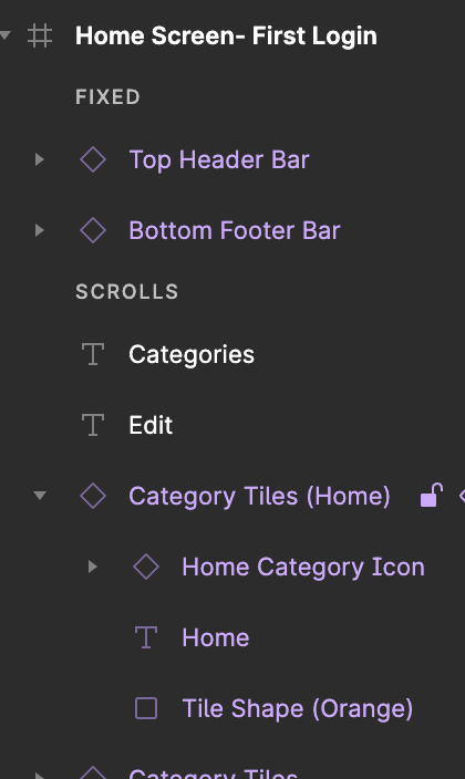
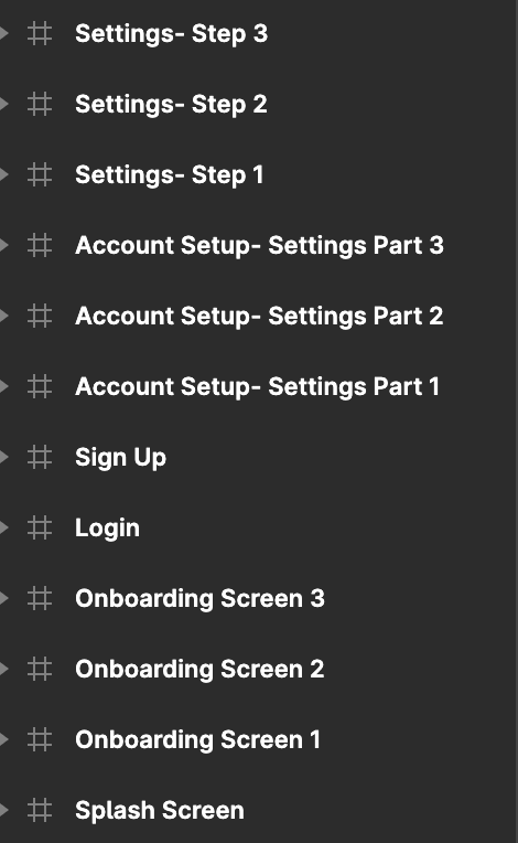
Layers and Text Styles:
Stage 7: Hi Fidelity Mockup
In transitioning from Mid Fidelity to Hi Fidelity, I decided to introduce three onboarding screens to showcase some of the app's features to new users who were just opening the app for the first time after downloading it from the app store. Additionally, I expanded the input boxes to the exterior margins and increased the vertical spacing to accommodate the drop shadow, ensuring optimal use of visual space on mobile devices.
Account Setup- Splash, Onboarding, Login & Sign Up Screens
Home Page- 2 Variants
Category Carousel
Category Page- Home
Overlay Pop-up
Photo Carousel
Export Page
Notifications Page
Stage 8: Prototype
In the prototype phase using Figma, I focused on bringing the high-fidelity designs to life, creating interactive mockups that closely simulate the final user experience. This process involved linking screens together, adding transitions and overlays, defining interactive elements to mimic real app functionality.
The goal was to create a realistic and engaging prototype that allows for thorough user testing and feedback. By refining the interactions and user flow, I could identify and address any usability issues early on, ensuring that the final product would be intuitive and user-friendly. This stage was crucial for validating design decisions and making adjustments before moving into development.
Swipe to delete using prototype feature in Figma
Animated notification icon
Final Prototype:
Try the mobile prototype here!
Hit the “R” button while using prototype to restart
Thanks so much for reading through my processes to creating this absolutely magical concept mobile app!


